June 23 - Exploratory Data Analysis
Exploratory Data Analysis (EDA) is the base work for any implementation with a Data Set. Usually, data is not clean, nor neatly formatted. Mucho of the time is spent dealing with NaN (missing) values, funny data and packages that are not working as they are supposed to. For this initial EDA I will try to take a look upon NaN values present in the chemical descriptor dataset.
Notes for this process:
- Count the number of occurances of a given value in a pandas dataframe.
- If I use
B3DB[B3DB.threshold == 'NaN'].count()all columns are listed with the number of times they have a 'NaN' value in thethresholdcolumn. - I notice that I often mix or confuse the use of
df.count()anddf.sum().Countmethod can be applied to numeric or categorical values. For example if there is a list with elements[man, woman, man, man, woman], applying.count()should yield the outputman = 3, woman = 2. On the other hand,Summethod can only be applied to numerical data. If we have a list with the numbers[3, 5, 4, 1], then applying.sum()should give as output13. The tricky part comes when these methods are combined. When a boolean filtration is made and upon this a.sum()is called, the effect is the same as counting for the filter value. - The command
len(B3DB[B3DB.threshold == 'NaN'])also works to know the number of instances that meet the filter value, in this caseNaN.
Cumulative Frequency Plot
These plots are a graphical representations of distributions over discrete variables. They are useful to see the progress of the accumulated frequency of a variable over a range of classes. They allow us to answer the following type of questions:
- What percentage of the data is above/below
Nvalue? - What are the values in the data that are above/below
N%of the dataset?
For my use case (B3DB dataset), I am interested to find the cumulative distribution of NaN values per molecular descriptor. This database is made up from ~7500 molecules, each one of them with ~1700 molecular descriptors, which were calculated with Mordred. As it is easy to think, the number of features is extremely large for an interpretable model, in this case we can see a scatter plot of the number of missing datapoints per descriptor and their frequency.
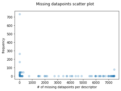
Just as it seems, the distribution is skewed to the sides, meaning that there are a lot of molecular descriptors (high frequency) with a few missing datapoints and also a significant number of molecular descriptors with a lot missing datapoints. This can be problematic for the further analysis. If the scatter plot is transformed to a cumulative frequency plot, we can appreciate this same information in the followin manner.
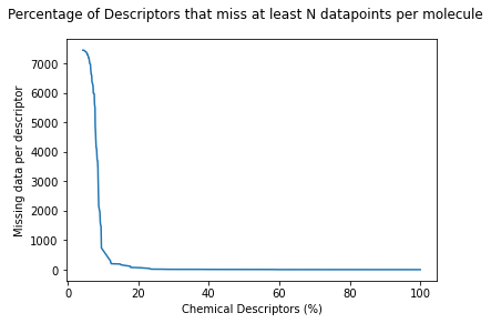
Where we can see that about 10% of all descriptors miss between ~7000 and ~500 molecular descriptors. After that, the graph quickly fades, meaning that about 80% of the descriptors have a very little number of missing values. Nevertheless that's a lot of low-quality molecular features. Beacause of this analysis, new descriptors will be calculated using PaDel.